The Amex GBT travel app allows travellers to manage efficiently every aspect of a business trip.
My role in this project was UX/UI Designer where I collaborated with the product manager to improve the experience of the home page and main navigation of the mobile app.
The initial approach was to interview about 15 business travellers, exploring how they travel for business and understanding what useful data/features would be helpful for them to have on the main page of their travel application. Part of the first interview also included a card sorting exercise that helped me have a clear idea of what features business travellers were willing to use as they login into the application.
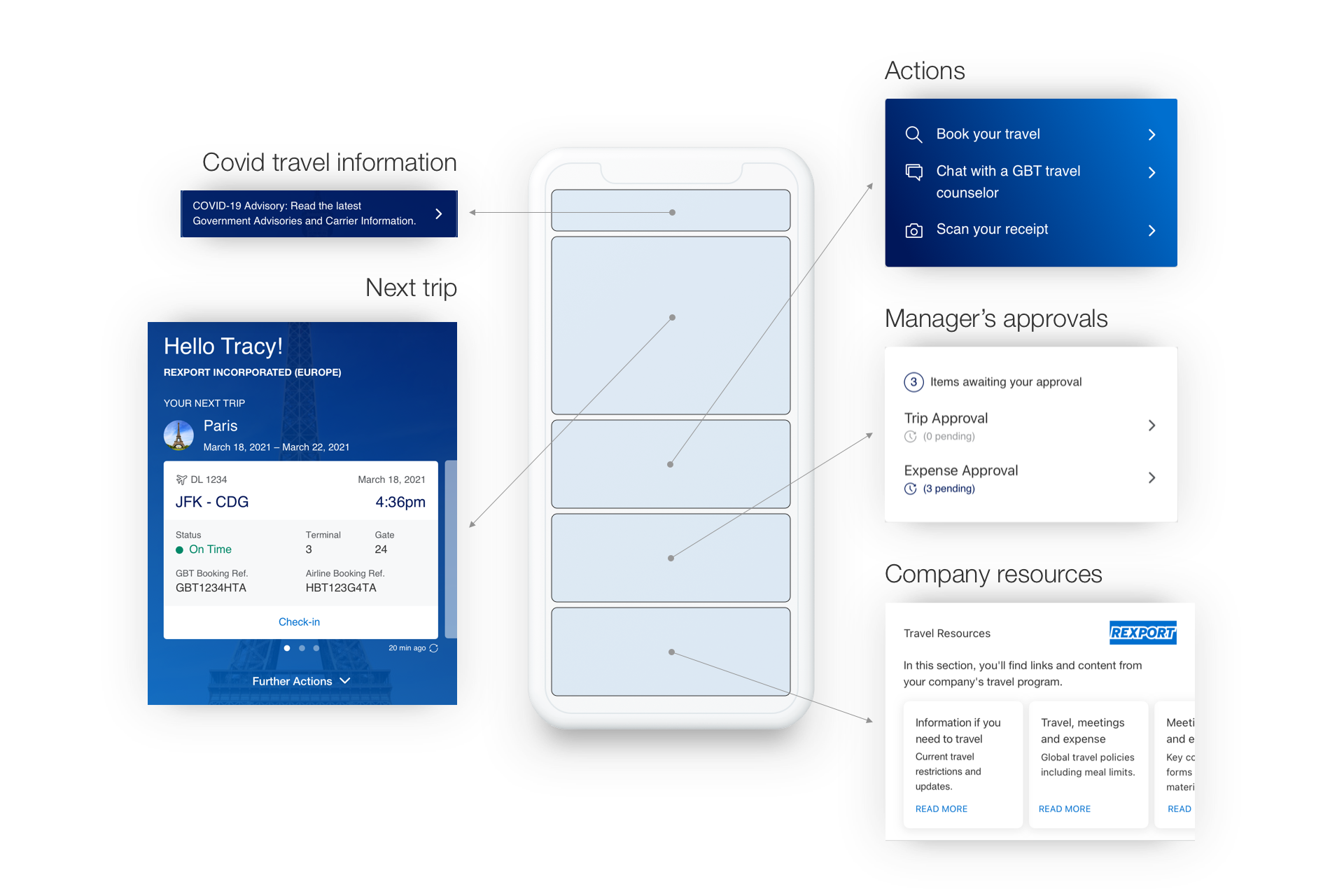
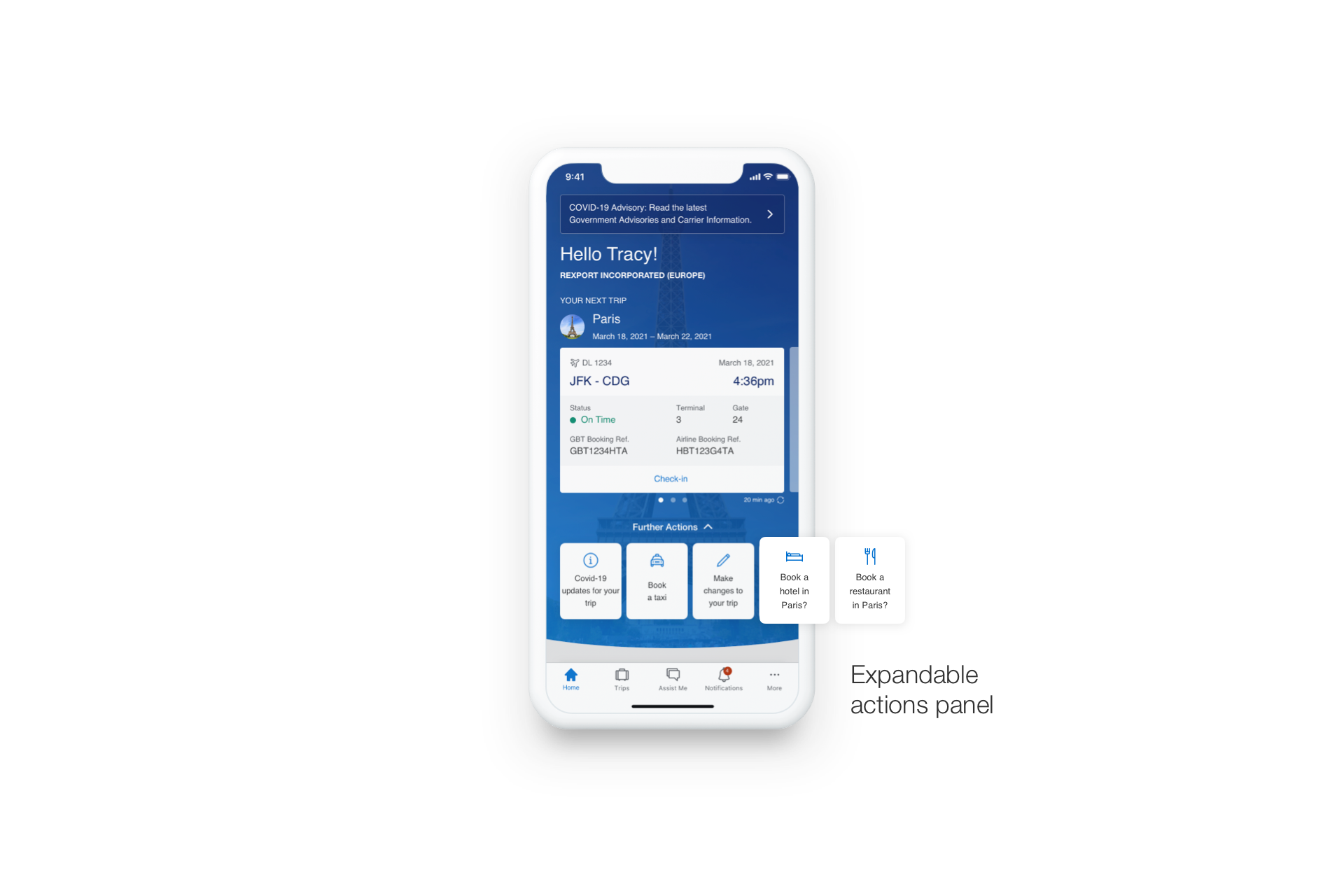
I analysed the interviews, understanding that all the travellers are keen to view on the homepage live updates of their trips, and a quick solution to get in touch with a travel counsellor while they are on the move.

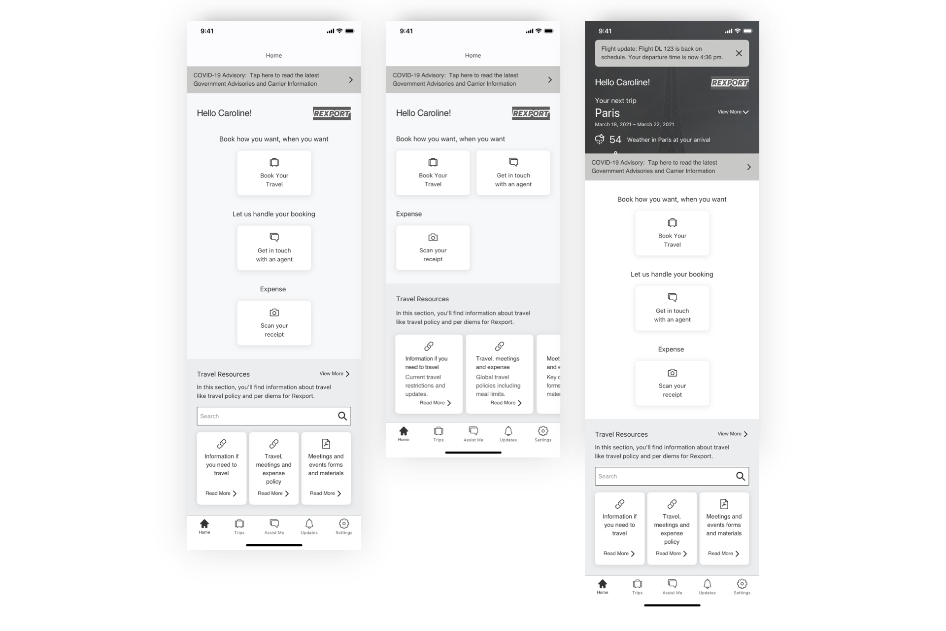
I mock up a series of wireframes to test with other travellers, proposing two scenarios:
- Before travel (book a trip)
- While on the move (scan data on the page)
These two scenarios help me to position the features and data in the right place on the page for the users.

I then decided to have a last run of interviews, where I tested the UI of the homepage following the two scenarios mentioned above, to understand if there was room for additional improvements before we began with the development.
