When I joined the mobile team at HRG I was hired to work alongside the UX Designer to redesign the Travel app.
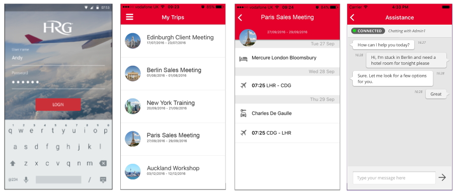
The HRG travel app makes easy access to business traveller trip information. Let the traveller see all the booked trips in a simple view list. Review all the reserved travel segments and received notifications about flight status, accommodation review, and contextual messages from the travel manager.

The first step I took in the rebranding process, was to research the best consumer travel apps and airline apps to understand what they were doing well and how on our current app we could improve the User Interface.
I defined the accessible colours palette to be used through the Travel app, and I made sure that it was consistent with the company products like the Online Booking Tool.
I collaborate with the UX Designer and the team to define the improvements we wanted to achieve after we gathered and analysed the user feedback.
Problem
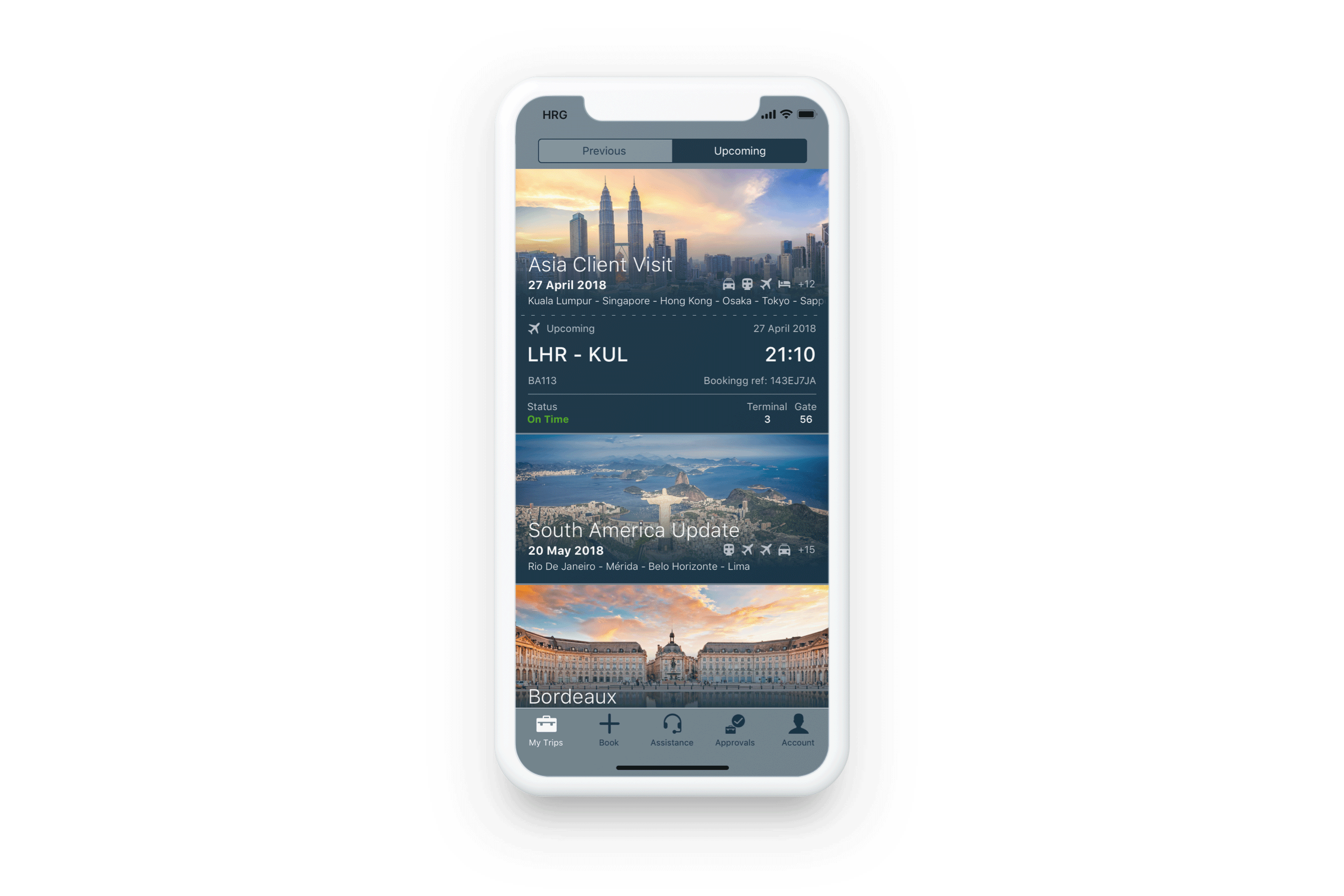
A problem we hit during the research phase was that travellers who do similar trips with a variation on their destination, visualise on the app a list of trips with the same destination name and city image.
Solution
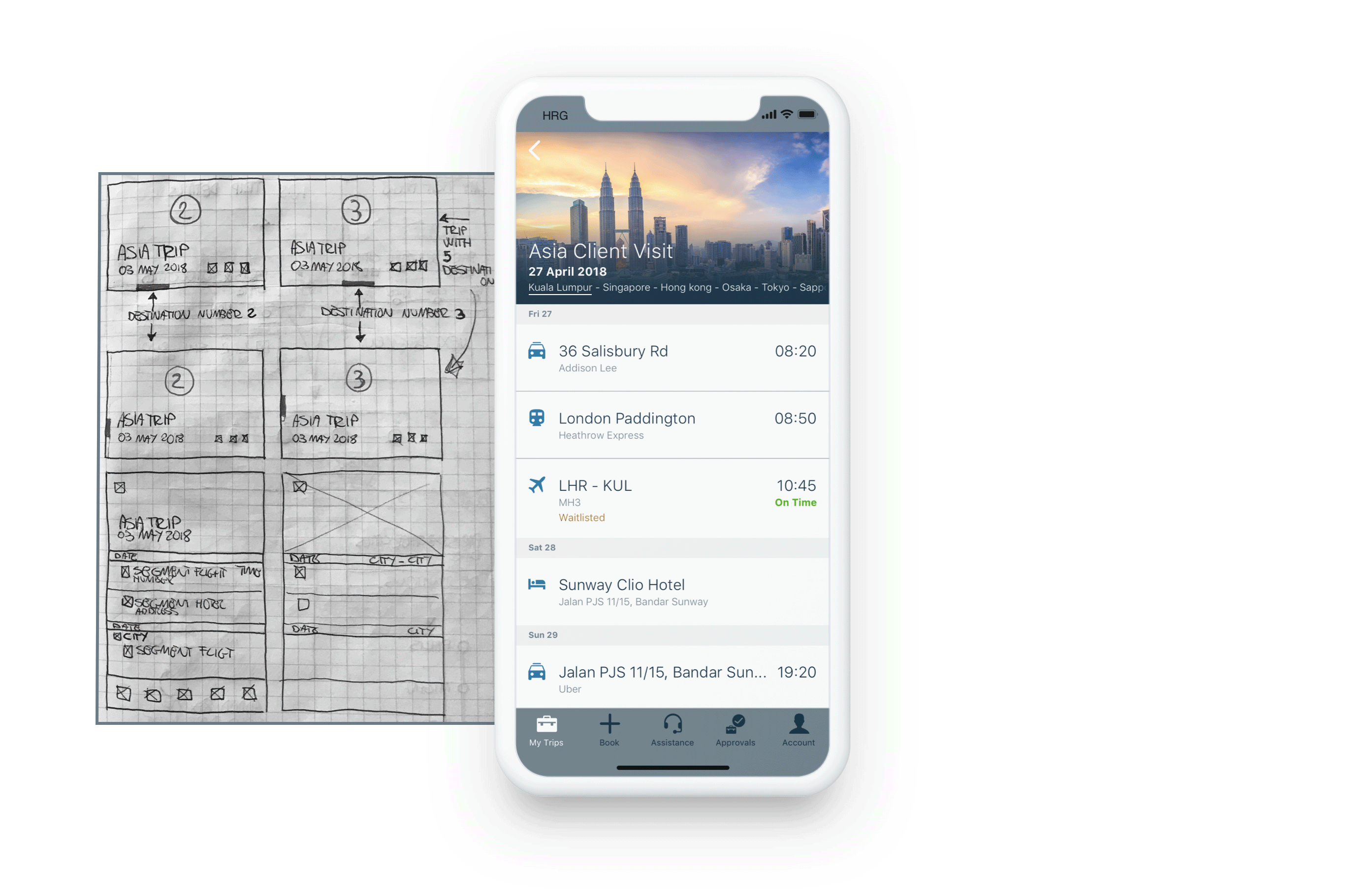
The UX Designer and development team found a solution that introduced a destination logic that used Google to map the correct city or town that the user is going to visit. I decided to include on the trip card a static carousel of city names that list the cities the traveller is going to visit. I also collaborated with the developers to incorporate an animation on the Trip Details level, which helps the traveller visually see what destination is going to visit during the trip.

Problem
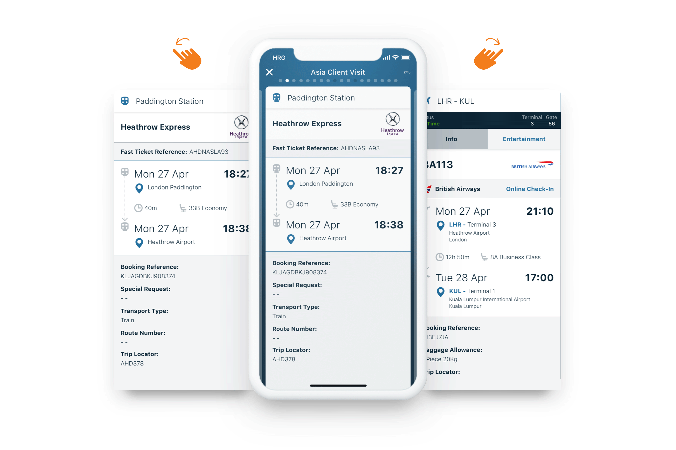
The feedback we received the most was that the trip information was not displayed in an easy to read view on the Segment level and the Next Segment Alert.
Solution
I worked on a new design that introduced a better way to show the hierarchy of booking information. We tested the design with selected users and agreed with the team on the best solution to implement the updates at the development level.
Problem
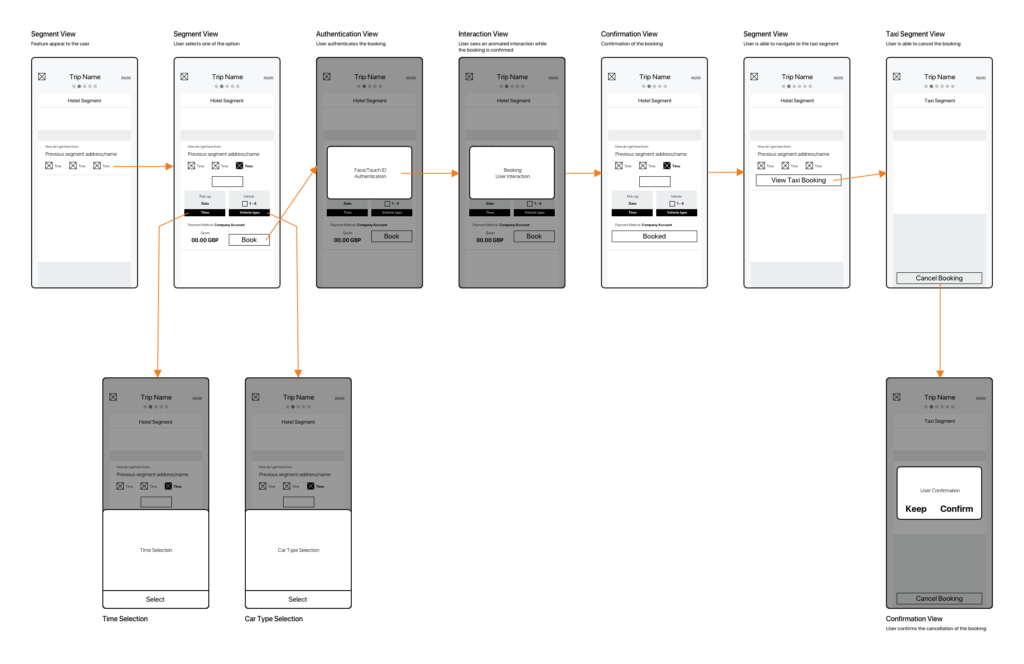
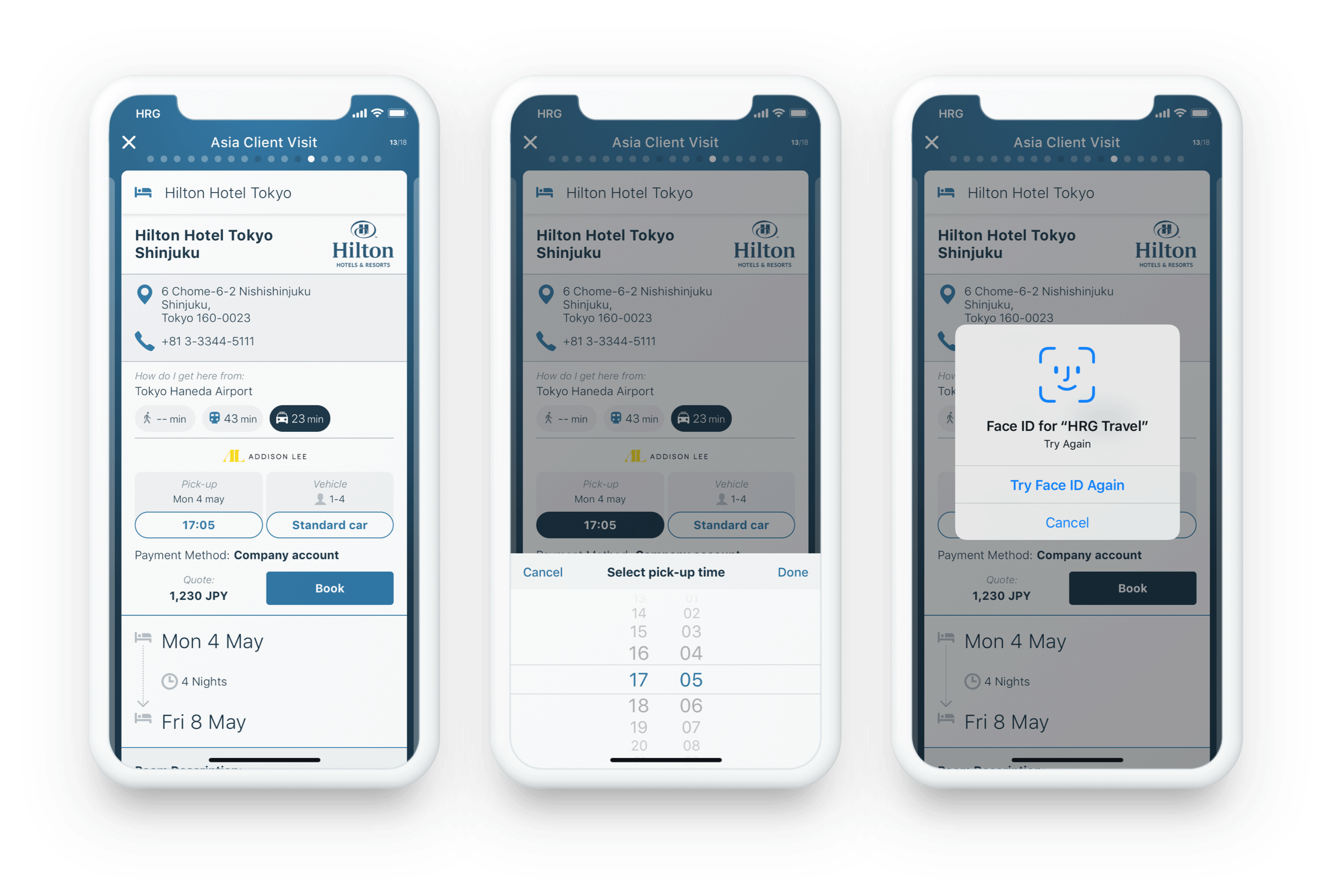
To help the traveller move from one segment to another, we used a Google API that offers different methods of transport from A to B. For example, after landing at an airport, we wanted to display to the traveller how to reach the hotel by walking, taxi, or public transport.
Solution
I worked following the requirements provided by the Product Manager to define a simple flow and interaction for the traveller to be aware of this feature at the Segment level.
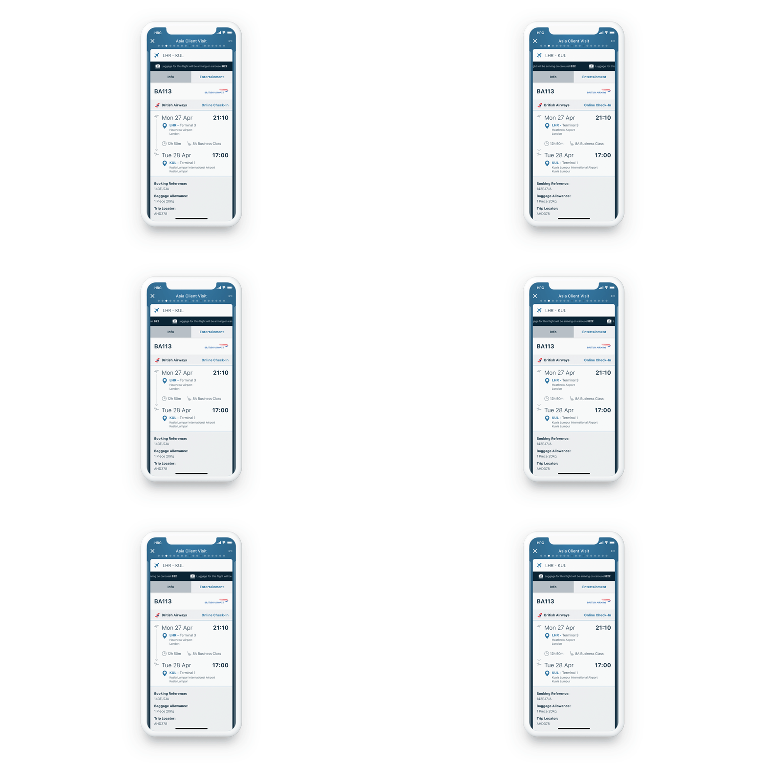
At the arrival airport, the traveller receives a notification that redirects to the segment card with information about where to collect their luggage.
Rather than a piece of static information, I decided to animate the bar to make it more prominent and eye-catching for the user, considering that it is the most important information after a flight has landed.
